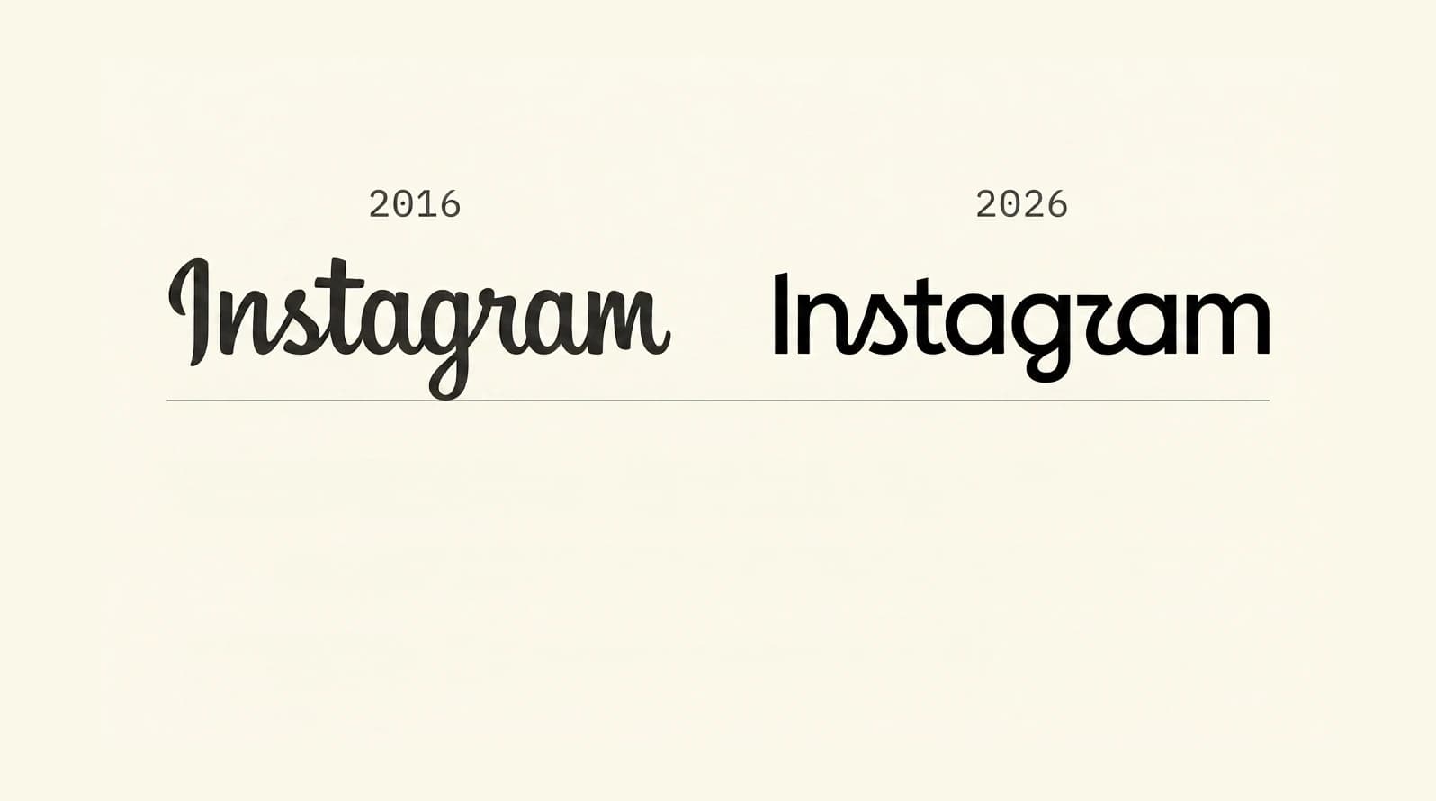
On the morning of August 13, 2026, Adam Mosseri, the head of Instagram, posted a new version of the Instagram wordmark to his own feed. It was Instagram's first wordmark update in ten years. Within hours, the internet was calling it "Instagzam."
The stylised "r" in the new lettering closes tight against the "g" and reads, to most eyes, as a "z." One commenter posted, "Instagwam, how a toddler would pronounce it. Perfect." Another asked whether the mark passes accessibility checks. Design commentary split down the middle: some welcomed the refresh, others accused Meta of shipping a "generic tech-company logo."
Mosseri seemed to be expecting it. He cross-posted the announcement to Threads with the note: "Thought I'd share this on Threads too and see what the hot takes might be." Sometimes the smartest brand move is to invite the internet to fire its guns and take the hits on your terms.
For any founder who has ever looked at their own logo and wondered whether it is time for a refresh, this is a live case study worth watching. Here is what actually changed, why the backlash landed, and the three lessons underneath it.
What changed with Instagram's logo in 2026?
The change is smaller than the reaction. Instagram updated its wordmark, the "Instagram" lettering that appears at the top of the app and in its brand materials. The familiar multicolour camera icon on your home screen is unchanged.
The refreshed wordmark still leans on script. It is bolder, more compact, and more geometric than the 2016 mark it replaces. Some letters connect, others do not. The distinctive stylised "r" and "s" are the ones the internet is joking about, and they are also the ones the design team is on record defending as intentional character.
Mosseri's own framing:
"The wordmark at the top of the app hasn't changed in 10 years, so it was time for a refresh. Cleaner and more modern, with references to the original and the simplicity and craft that's always made it Instagram."
The wordmark is one piece of a broader identity system Meta is rolling out through 2026 and beyond. That system includes three custom in-house typefaces:
- Instagram Sans, the sans-serif family first introduced in 2022, now refined with wider proportions, smoothed curves, and flatter terminals.
- Instagram Pen, a new handwriting typeface developed by testing "everything from soft pencil to bold ink pens," evolved from earlier handwriting collaborations Instagram has done with artists like Rosalía and Olivia Rodrigo.
- Instagram Mono, a new monospaced typeface, rounding out the system for contexts that need fixed-width lettering.
All three are proprietary to Meta and are not available to license. The refresh also lightens the use of Instagram's signature gradient across UI surfaces, keeping the multicolour identity but applying it with more restraint. The team is entirely in-house at Meta. Named design leads on record across the coverage include Jasmine Probst, Director of Product Design at Instagram, and May Hartono, Christy Silva, and Cynthia Pratomo on the Meta brand design side. No external agency is credited.
How the Instagram logo has evolved since 2010
The camera icon and the wordmark have cycled through distinct lives:
- 2010. A skeuomorphic Polaroid-inspired camera with a rainbow stripe, hand-drawn for the original iOS app.
- 2016. The flat gradient square with the white camera outline that has been on every home screen since, and the cursive script wordmark widely attributed to typographer Mackey Saturday and often reported to be based on the Billabong display face.
- 2022. Introduction of Instagram Sans, the custom sans-serif family designed in partnership with Colophon Foundry.
- 2026. The wordmark refresh, three new custom typefaces, and a system-wide identity update.
The 2016 gradient icon has now survived two wordmark generations. That is deliberate. Meta's own designers, in the coverage around this refresh, said stripping out the script left them "unrecognisable to ourselves." Recognition is the equity that stays untouched.
Why does the new Instagram logo look like "Instagzam"?
Three things stacked at once.
The letterforms are ambiguous. The stylised "r" in the new wordmark closes tight against the "g," and to most readers the pair reads as a "z." The lowercase "s" has a rounded stroke that some people read as an "a." Both are conscious craft decisions in a script-inspired display face. Craft decisions that trade legibility for personality carry a real business cost when the audience is more than three billion users a day.
The accessibility question is unresolved. Meta's own copy for Instagram Sans says the typeface is "designed with accessibility and global scripts at the core." The wordmark itself is a custom drawing, not a typeface, and accessibility guidance covers contrast ratios and text size directly but says much less about custom letterform ambiguity. That gets judged by testing, not by ratio. Two hours of "Instagzam" jokes are exactly the kind of test that never appears in a WCAG audit.
Design commentary is split. Social media consultant Matt Navarra called the mark "fresh, modern, true to the original" while acknowledging that "design peeps are going to have a fun day tearing it apart." Others in the design community are less generous, framing the new lettering as a step toward a generic tech-brand aesthetic and away from what made Instagram feel like Instagram. Creative Bloq called the result a moment of "peak blanding." Both readings are defensible.
The comms craft, at least, was strong. Meta explained the thinking upfront and invited the hot takes rather than pretending the response would be uniformly warm. That is the right move for a mark that lives on hundreds of millions of home screens.
How other brands piled on and turned the backlash into a marketing moment
Within twenty-four hours of the announcement, the reaction stopped being just user snark and started being marketing. OpenAI's ChatGPT account posted a parody in the new Instagram wordmark aesthetic: the same ambiguous letterforms that made "Instagram" read as "Instagzam" rendered ChatGPT as "chatjipti." Caption: "no notes." Social-marketing tools like Metricool joined in with jokes about the extra work now facing every community manager who suddenly needs to update their Canva templates. Designers across X and LinkedIn published their own "corrected" versions of the wordmark, each one arguing for a different fix to the r-versus-g ambiguity.
None of it was coordinated. None of it was paid. It happened because Meta gave the internet a target and the smart brands moved fast enough to catch the wave while the meme was still peaking.
That is the fourth lesson underneath the first three, and it belongs to founders who play in social-heavy categories. Cultural moments are marketing windows. When a billion-user brand ships something the internet is going to talk about for a week, every brand adjacent to the story has twenty-four to forty-eight hours to piggyback on the algorithmic energy for free. The brands with an existing design point of view, a fast comms sign-off, and a social team ready to ship a response inside a day are the ones that get the lift. The brands that spend three days getting legal to approve a tweet get nothing.
You cannot manufacture these moments. You can only be ready for them.
Three lessons every founder should take from Instagram's rebrand
1. Legibility is a business risk, not a design preference
WCAG contrast ratios protect against low contrast. They do not protect against ambiguous letterforms. If your wordmark scores fine on an accessibility audit but strangers can read it wrong, you have shipped a business risk, not a design decision. Test your mark in the environments it actually lives in: dark backgrounds, small phone screens, thumb-scroll speed, moving thumbnail carousels, print at 8-point on the bottom of an invoice. If more than a handful of testers hesitate on any letter, the mark is not finished.
2. A refresh is still a rebrand from the customer's chair
Instagram kept the camera icon. Meta calls this refresh a refresh, not a rebrand. From inside the studio, that distinction is meaningful. From the customer's chair, it is not. Every changed pixel reads as change. Users react to the changes they can see, not to the ones the design brief exempted. That means the governance for a refresh (research, testing, phased rollout, comms plan, a way to talk about it publicly) has to be the same as the governance for a full rebrand. Scope a refresh as "just a font change" and you get exactly the reaction Instagram got.
3. Recognition is the equity you are spending
The most useful sentence in all of the coverage came from Cynthia Pratomo, one of Meta's brand design directors, quoted in the design press:
"Every time we stripped out the script, we became unrecognisable to ourselves."
That is the whole lesson. Instagram's 2016 script had ten years of muscle-memory equity baked into it, seen billions of times a day. Any change to what people recognise spends some of that equity. Meta could have gone further, redrawing the gradient camera icon too. They did not, because ten years in, that flat multicoloured square is one of the most recognisable app icons ever shipped, and the equity was worth preserving. The founder question is the same one their team asked out loud: what is the equity worth, and how much of it are we willing to spend?
Forbes put it neatly in its coverage. A mark seen this many times a day is "less a design asset than public infrastructure." Founders whose logos are on invoices, delivery vans, storefronts, hardhats, and email signatures are operating with public infrastructure at their own scale. Treat it accordingly.
How we think about brand refreshes at Sapere Digital
Every time we scope a brand or wordmark refresh, we start with two questions: what recognition equity are you carrying, and what is the business outcome that justifies spending some of it?
If the answer to the first is "not much" (a new business, a rebrand tied to a merger, a fundamental repositioning), the equity floor is low and the change can be bolder. If the answer is "a decade of customers who know exactly what our card looks like in a wallet," the equity floor is high and the burden of proof for change is higher too. Either way, we build the governance in from day one: legibility testing before launch, a phased rollout that preserves the icon or wordmark elements customers depend on, and a comms plan so the change lands as a story instead of a surprise.
Craft, backed by numbers. Even for a font change.
Sources
- Variety: Instagram Unveils 'More Modern' New Logo, and People Are Already Making Fun of It
- TechCrunch: Instagram introduces a redesigned wordmark
- Meta Design Blog: Built to celebrate creativity, the new Instagram brand identity
- It's Nice That: "Instagram has evolved," the process and craft behind Instagram's first major refresh in over ten years
- Creative Boom: Instagram reveals its first brand refresh in 10 years, with a new wordmark and three typefaces
- Creative Bloq: Instagram just redesigned its logo for the worst possible reason
- Marketing4eCommerce: Instagram or 'Instagzam,' that is the question
- OpenAI's ChatGPT Instagram parody post ('chatjipti' / 'no notes')
- Dezeen: Instagram rebrand references the "individual expression" of the app
- Forbes: Instagram Retires Its Cursive Wordmark After A Decade
- Fast Company: Instagram has a new wordmark
- PR Daily: The Scoop, people are mocking Instagram's new logo
- CBC News: Instagram unveils 1st new wordmark in a decade. Not everyone is happy