Mercury Foodservice
Independent Hamilton foodservice distributor, since 1993
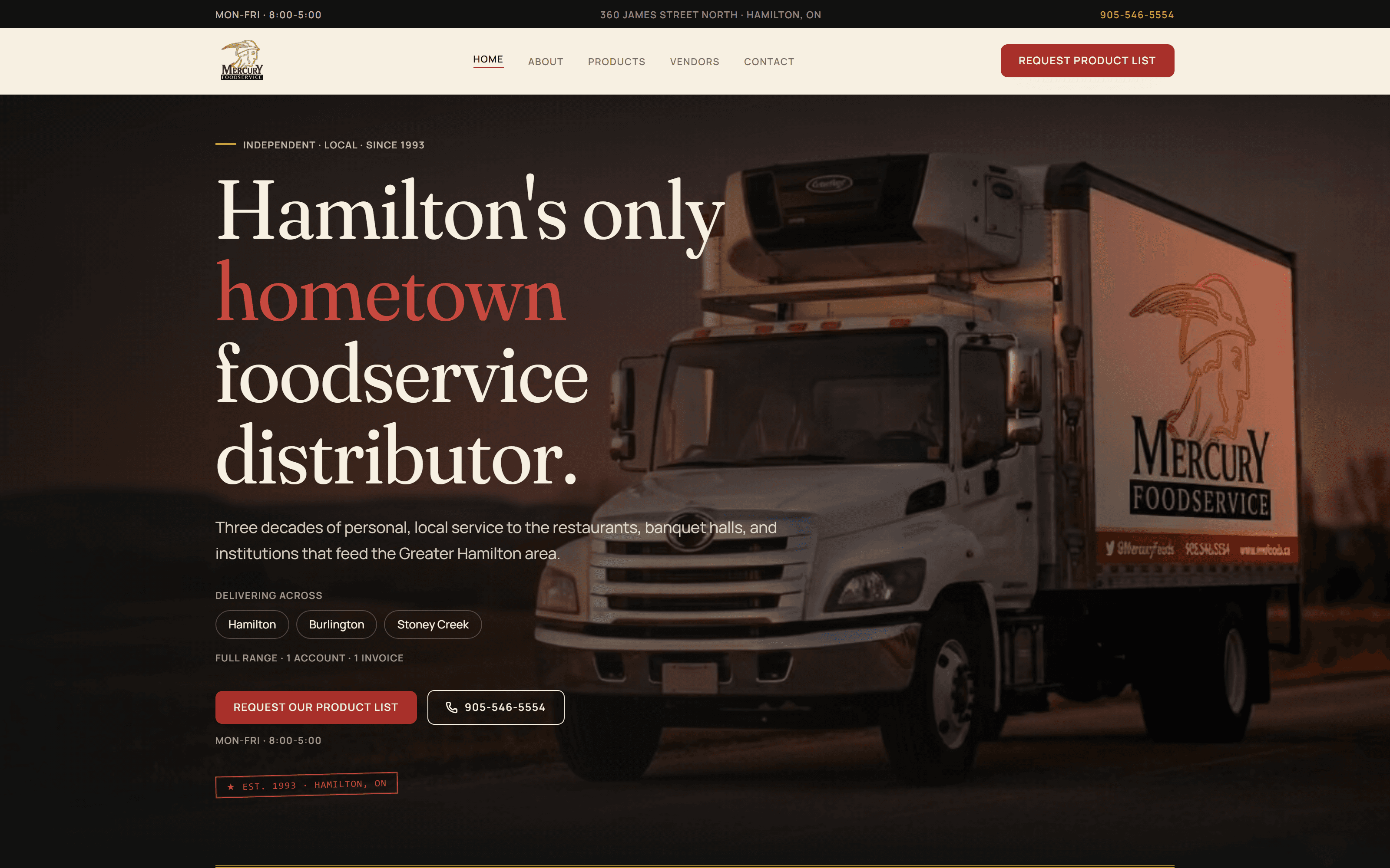
Hamilton's only hometown foodservice distributor, operating since 1993. First working trade-facing web presence in two years after the previous WordPress install went dark and was replaced with a scrolling-truck "coming soon" page in May 2024. New build shipped on real client photography, thirty-two named vendor relationships, and a printable Brand Guidelines PDF as a v1 deliverable. Phase 2 vendor and SKU listing layer in active build.
What actually shipped, in the studio's own words.
Public site live at mwfoods.ca on real Mercury photography (warehouse floor, delivery truck at the LIUNA Station complex, team at the order counter, real product packshots on the shelf). Brand system shipped as a one-page printable PDF: Fraunces variable serif wordmark with a gold winged-Mercury helmet, tomato-red "Foodservice" accent, cream paper canvas, and an "Est. 1993 · Hamilton, ON" deli-stamp treatment. Thirty-two vendor partners named and linked on a dedicated /vendors page. Contact form routes straight to the orders inbox. Mail stayed on NAS.net through the cutover so info@ and orders@ never bounced.
What the business actually looked like when we started.
Mercury Foodservice has been the hometown foodservice distributor for Hamilton, Burlington, and Stoney Creek since 1993. Restaurants, banquet halls, faith organisations, community centres, and food trucks call the same phone number some accounts have been dialling for twenty years. The service radius is tight enough that the truck can be at your door before lunch service. Ordering is account-based, not e-commerce, and the trade relationships are real.
Very little of that was legible online. From May 2024 through mid-July 2026, mwfoods.ca served a single "Under Construction" page with a scrolling truck GIF, sitting on top of an abandoned WordPress 3.6-era install last touched around 2020. Access logs from the last two weeks of that stretch showed traffic collapsed to roughly one hundred to one hundred and fifty requests a day, more than ninety percent of which were bots and scrapers. Real prospective customers looking the business up found a broken loading animation, and long-time accounts had nothing digital to point new staff at.
The engagement began with an ownership transition already underway. The project's SPEC was explicit that the previous owner's personal story and family restaurant lineage were not to appear on the new site. The old About page, still cached and still discoverable via Wayback and hosting backups, named the previous owner and reproduced the family history in detail. Reproducing any of that would have handed a new owner a live customer-facing site telling somebody else's story under his own brand. The whole engagement had to hold up around that constraint without ever discussing it out loud on the site.
What we did, how we did it, and what changed.
The brief was simple to say and hard to hold. Restore a thirty-year Hamilton institution to a working web presence, in a voice that carried the operating history forward without republishing the previous owner's personal history, without inventing anything the new owner could not stand behind, and without the templated foodservice-distributor look that would flatten a real regional brand into a stock catalog. On top of that: no e-commerce, no cart, no live pricing. This is a trade site whose job is to make it effortless to call, email, request the current product list, or open an account. Every design and copy decision had to earn its place against that plainer purpose.
Ground-up Next.js App Router rebuild with a content layer separated from the components so every string a non-developer would ever want to edit lived in one folder. Tokens, tokens, tokens: warm espresso, cream paper, gold, tomato, and roast, defined once as channel-based CSS variables so Tailwind opacity modifiers worked cleanly across the whole system. A Fraunces display serif paired with Manrope for body carried the type. A gold winged-Mercury helmet, adapted from the mark already painted on the trucks, anchored the identity. The "Est. 1993 · Hamilton, ON" deli-stamp appeared consistently at hero, footer, and product hero, so the operating history read as a signature rather than a paragraph. Every unconfirmed fact rendered as a visible TODO(client) placeholder during the build, so nothing shipped as an assertion until the owner had signed off.
Live at mwfoods.ca in mid-July 2026, cut over from the abandoned NAS.net Plesk hosting to Vercel in a single coordinated DNS session that kept mail on NAS.net so info@mwfoods.ca and orders@mwfoods.ca never bounced. The contact form began delivering to the orders inbox on day one. The scrolling truck GIF is gone. In its place is a working piece of the business: a phone number that connects, a product page that answers, a vendor list that reassures, and a contact route that reaches the desk that can actually do something about the request. Long-time accounts finally have somewhere to point new staff. New accounts have a real front door.
The specific calls we made along the way.
Discovery, and a recovered SKU archive
The build ran on the fact that the previous digital footprint was almost entirely dark. There was no CMS to migrate from, no analytics history worth reading, and no current product list to work from at kickoff. What did exist, and what almost nobody knew existed, was a full Plesk backup of the abandoned WordPress install. Buried in wp-content/uploads was Current Public List.pdf: two hundred and eighty-nine SKUs organised by category, with codes, descriptions, brands, pack sizes, box codes, and prices, plus around sixty category-specific PDF sheets and five seasonal flyers. Prices were roughly five years stale, but the codes, brands, and structure were still relevant. That archive grounded the category work, the vendor list, and the eventual Phase 2 catalog scope. We would not have known what the business actually carried without it.
A brand system built around a mark that was already on the road
Mercury's identity was not something to invent. The winged Mercury helmet had been on the delivery trucks and the price sheets for decades. What did not exist was a coherent kit that let the same mark work on a website, a product PDF, a delivery-note letterhead, and a phone screen without redrawing itself each time. We built the system around what the business already looked like. Gold for the helmet mark, kept in the palette Mercury had always used. Tomato red reserved for the word "Foodservice" and for interactive elements like buttons and form feedback, load-bearing rather than decorative. Cream paper as the primary surface. Espresso as anchor bands at hero and footer. A small, consistent "Est. 1993 · Hamilton, ON" deli-stamp that did most of the work of saying "we have been here a while" without a paragraph of copy trying to do the same.
Photography, and refusing to lean on stock for identity shots
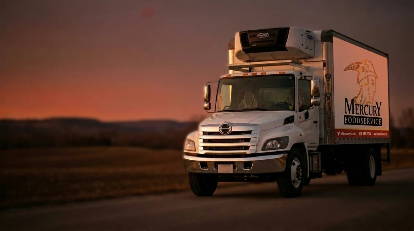
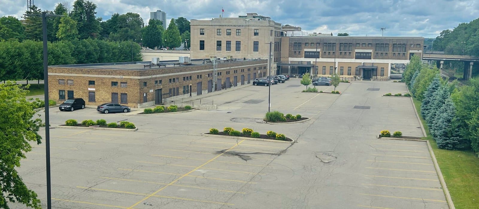
The single decision that made the site feel like Mercury rather than a template was refusing to use stock for anything that had to represent the business itself. Placeholder tiles held those slots open during the build, with real Mercury photography arriving in two batches during the review pass. Twenty-five photos shot; sixteen used across the live site. The warehouse floor. The delivery truck at the LIUNA Station complex. The team at the order desk on the phone. Real product packshots on the shelf: Venetian Meats Siciliana salami, IJA and Cogruet cheese, Edesia paprika, bread. When a long-time account opens the About page and sees the receiving door they have driven past for a decade, the site stops feeling like a rebuild and starts feeling like a continuation.
Vendors as public receipt
Foodservice runs on trust in the supply chain. A distributor's vendor page is not marketing decoration; it is a working document. An accounts-payable clerk trying to remember whether Mercury still stocks a particular line does not want to make a phone call to find out. Thirty-two vendor relationships live on a dedicated /vendors page, alphabetised so the arrangement does not imply a ranking, with each partner's real logo and a link back to their own site. Every outbound vendor link carries rel="noopener noreferrer nofollow sponsored" per Google's guidance for authorized-distributor pages, which satisfies annual vendor-agreement clauses without passing PageRank editorially. Logos went through a full-colour, uniform pass after client review: no dim grayscale hover treatment, every mark holds the tile at equal weight.
A printable brand guidelines PDF as v1
Alongside the site we shipped a one-page printable Brand Guidelines document. It shows the mark, the palette in RGB and HEX, the type pairing, the deli-stamp usage, layout and shape tokens (radii, warm two-stop shadows, container widths), and the voice rules the site enforces (no em dashes, Oxford commas, hometown regional voice, trade-facing not consumer). It is what a signage shop actually needs to keep the brand consistent when Mercury orders new truck decals, or a printer wants to check the tomato is the right tomato. The full HTML lives in the repo alongside the tokens it documents, so it can be regenerated if the palette ever changes.
Cutover, and preserving thirty years of mailboxes
Go-live was the highest-risk single step in the engagement. Mercury's mailboxes at info@mwfoods.ca and orders@mwfoods.ca are printed on the truck. Dropping those, even for an hour, would have been a bigger problem than the two-year outage the site itself had already lived through. The plan (written into the project SPEC three months before it was executed) was to keep DNS authoritative on NAS.net, leave every mail record untouched, and only repoint the web A record and www CNAME to Vercel. Before touching the apex, four SRV and CNAME records that followed apex were unhitched from it so they would not get dragged along. Resend was verified on a send. subdomain rather than at apex, so the existing SPF record never had to be modified. Env vars were set in Vercel and the contact form was smoke-tested against the orders inbox before DNS was flipped. Live within minutes of cutover. Full smoke test across every route and the contact endpoint returned green.
Phase 2, in active build
Phase 2 is currently in flight: a vendor listing and SKU-level catalog surface that will let long-time accounts self-serve product confirmation instead of picking up the phone for a lookup. The recovered 289-SKU archive is the working scaffold. Category structure, brand cards, and the vendor page shipped in Phase 1 all feed forward. Everything is being built the same way Phase 1 was: real content in a data layer, no fabrications, visible placeholders until confirmed, and the same guardrails on ownership language and customer naming that governed the first pass.
Real shots from the project.
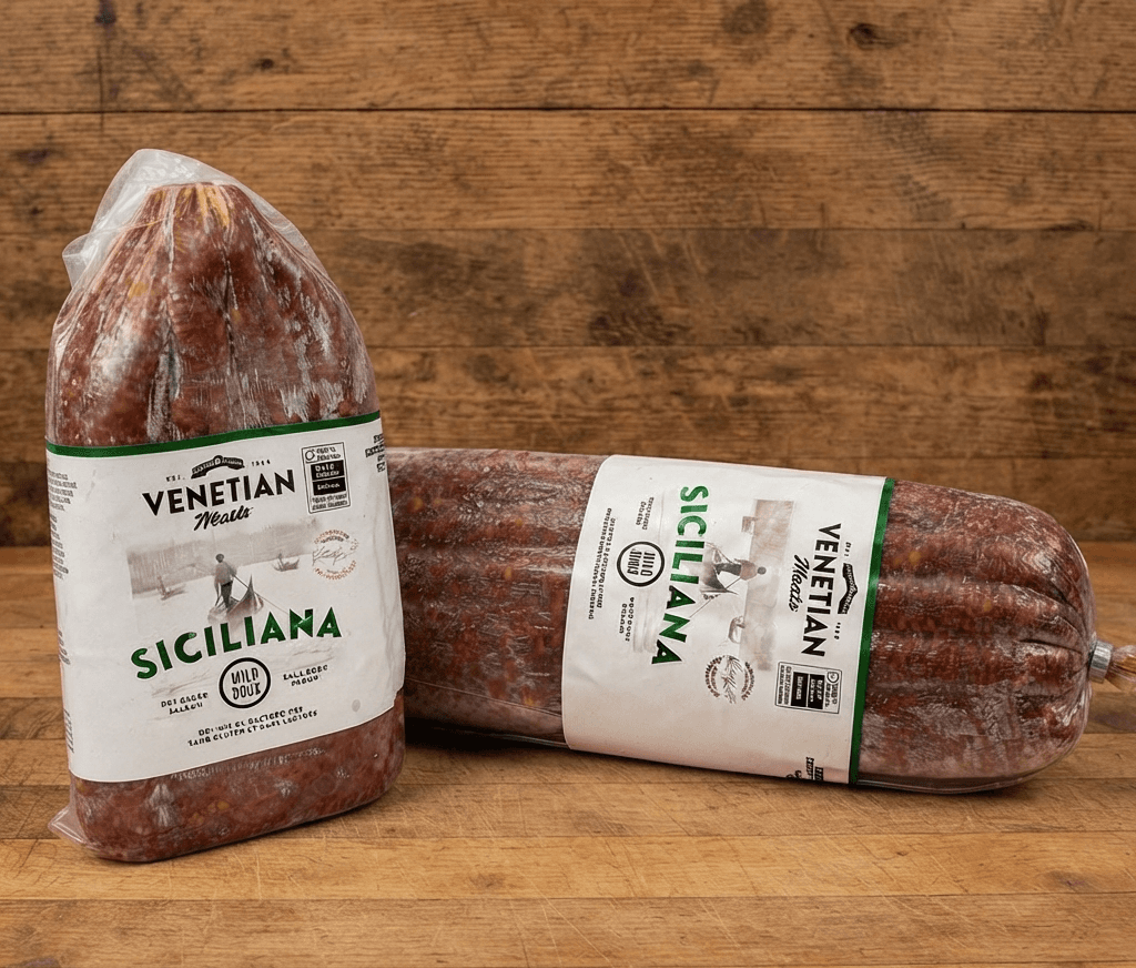
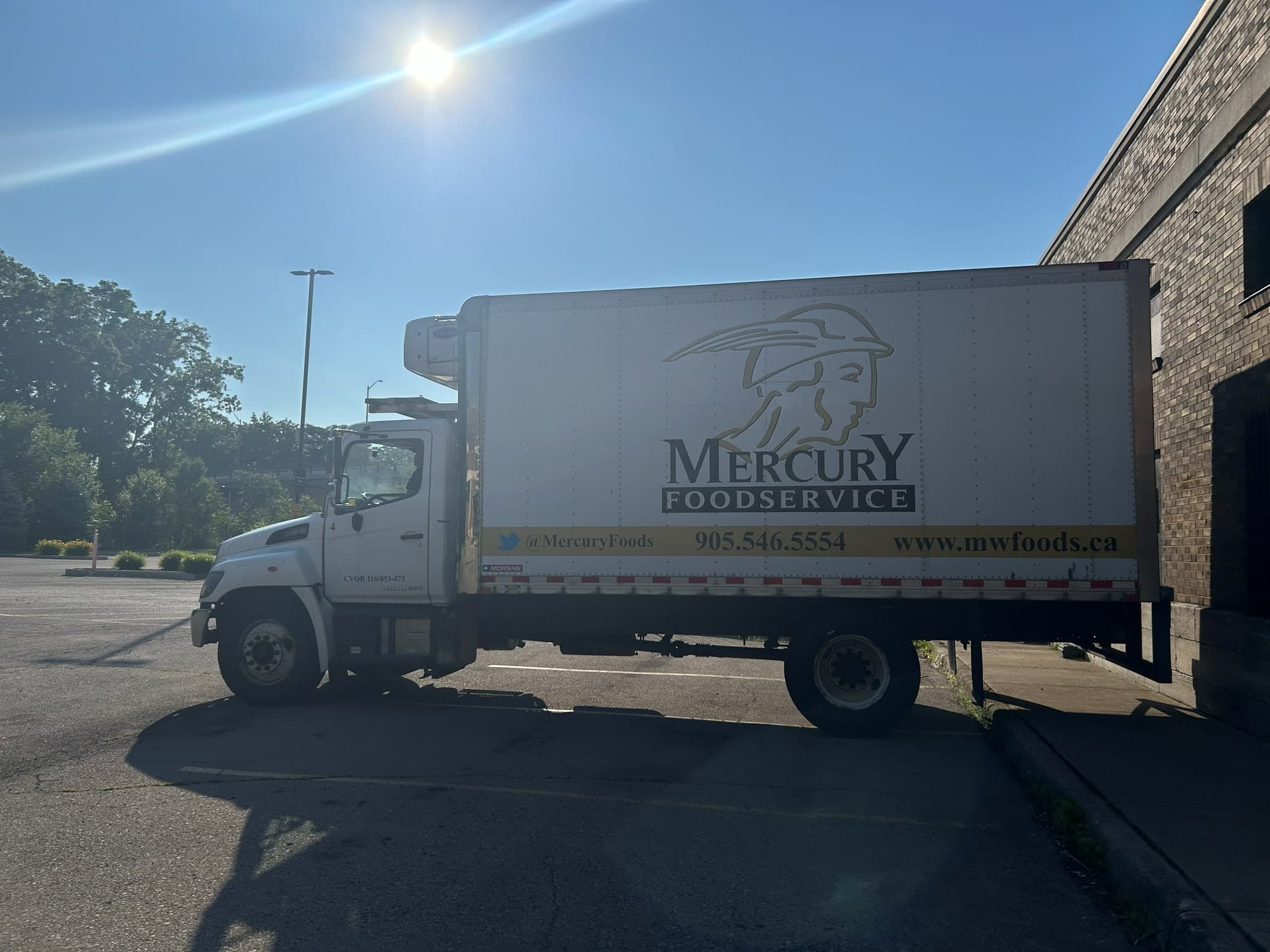
The judgement calls that made this project what it was.
Voice of seamless continuity, not "under new ownership"
The heritage transferred with the sale; the previous owner's personal story did not. The site speaks as Mercury, Hamilton's distributor since 1993, and never announces a sale. The About copy is built so a future "proud handover" paragraph can be slotted in without a rewrite, if and when the owner ever wants to change the framing.
No "family-owned" claim anywhere on the site
Family-owned would only be true if confirmed of the new owner. It was not confirmed. Many long-time customers knew the previous owner personally, and a false claim would have been the fastest way to erode trust with exactly the accounts we most wanted to retain.
Placeholder discipline until the client confirmed each fact
Every unconfirmed detail (customer names, buying-group memberships, contact operational facts, brands actively carried) rendered as a visible TODO during the build rather than an assertion. That let us ship a strong-looking site early for review without ever committing to a claim we could not defend. A client-tracked TODO table gave the client one place to answer questions and one place for those answers to land in code.
Real photography over stock for anything identity-carrying
Warehouse, truck, and team shots that came from stock would actively misrepresent a real 1993 Hamilton business. Stock was allowed only briefly for four generic product tiles during the placeholder phase, and every one of those was swapped for real Mercury product photography once the client shoot arrived. The warehouse, truck, and team frames stayed as branded placeholders rather than accept the misrepresentation.
Mail stays on NAS.net through cutover; only web records move
Info@ and orders@ are painted on the truck and printed on order sheets going back decades. Dropping them for even an hour would have been a bigger problem than the two-year web outage. Keeping DNS authoritative on NAS.net and touching only the A and www records was the lowest-risk path with the fastest rollback if anything went wrong.
Dedicated /vendors page in full colour, not a dimmed strip
First pass rendered the vendor logo wall at reduced opacity with a grayscale-to-colour hover, which is the industry-standard vendor-wall pattern (Sysco, GFS, Gordon's). The Mercury client asked for full colour and a dedicated page instead. Foodservice vendor relationships are a source of pride, and treating them as ambient decoration undersold the strongest working differentiator on the site.
Outcomes we can point at.
- 01
First working trade-facing web presence in two years
From May 2024 to mid-July 2026, mwfoods.ca served a scrolling truck GIF under an "Under Construction" banner. Since cutover the site has been up on real photography, with a working contact route into the orders inbox, and long-time accounts finally have somewhere digital to point new staff.
- 02
Thirty-two vendor relationships on public record
The dedicated /vendors page names and links every supplier partner Mercury sources directly from, satisfying annual vendor-agreement clauses without passing editorial PageRank and giving accounts a working directory they can trust between phone calls.
- 03
289-SKU archive recovered from the abandoned WordPress install
A Plesk backup of the dormant hosting turned up the full 2020 product list plus roughly sixty category-specific PDFs and five seasonal flyers. Prices are stale, but codes, brands, and structure are still relevant, and this is the working scaffold for the Phase 2 catalog surface currently in build.
- 04
Zero mail interruption through DNS cutover
info@mwfoods.ca and orders@mwfoods.ca continued to work through the transition without a bounce. The old apex A moved to Vercel; every MX, SPF, DKIM, and DMARC record on the domain stayed exactly where it was.
- 05
Printable Brand Guidelines PDF shipped as a named deliverable
A one-page, self-contained Brand Guidelines v1 landed in the repo alongside the code, ready to hand to a signage shop, a printer, or a future partner without translation.
- 06
Legacy URL redirects, so search-engine traffic still lands
Google was still surfacing the old WordPress /featured-products/ path after cutover. A permanent 308 redirect catches every variant of the legacy path and forwards to home, so any customer arriving from a stale search result lands on a working site rather than a 404.
The concrete artifacts of the engagement.
- Public marketing site live at mwfoods.ca (Home, About, Products, Vendors, Contact)
- Dedicated /vendors page listing thirty-two supplier partners with outbound links
- Full brand system: gold winged-Mercury mark, tomato accent, cream canvas, deli-stamp treatment
- Fraunces display serif + Manrope body type pairing, tokenised in code
- Printable one-page Brand Guidelines PDF (v1)
- Resend-powered contact form routing to the orders inbox
- Real client photography direction and processing pipeline (25 photos shot, 16 used)
- DNS cutover from NAS.net Plesk hosting to Vercel with mail preserved end-to-end
- Legacy URL 308 redirects for stale WordPress paths
- Recovered 289-SKU archive from the abandoned WordPress uploads, staged for Phase 2
Working with Muhammad on our new website has been a great experience from start to finish. He was incredibly responsive to feedback, patient through multiple revisions, and willing to make suggestions along the way. I'd highly recommend his services to anyone looking for a talented and reliable web designer.